Branding & WEBsite DESIGN FOR Denver Dentist
Blue Spruce Dental
LOCATION: DENVER, COLORADO
Client Background
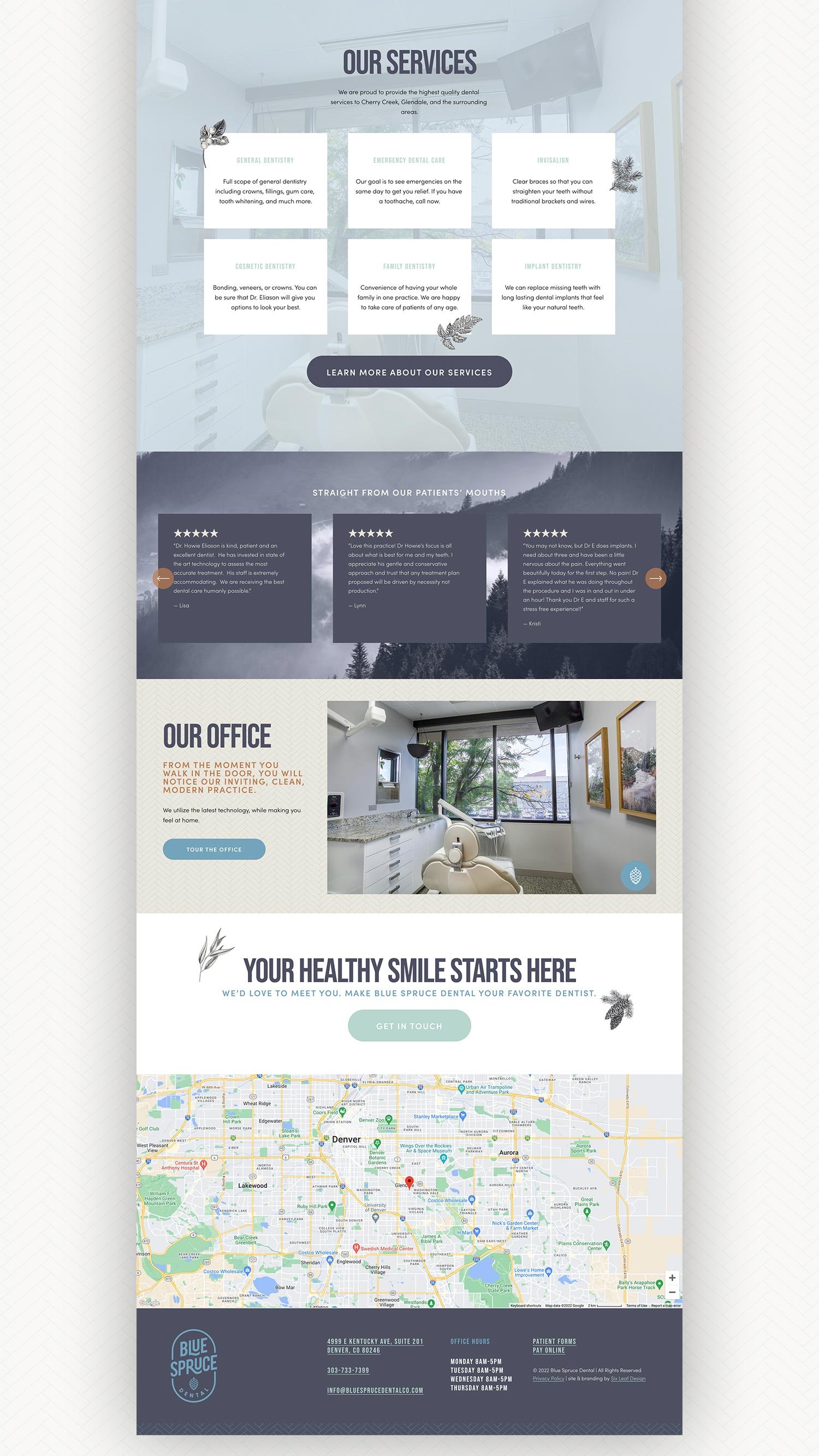
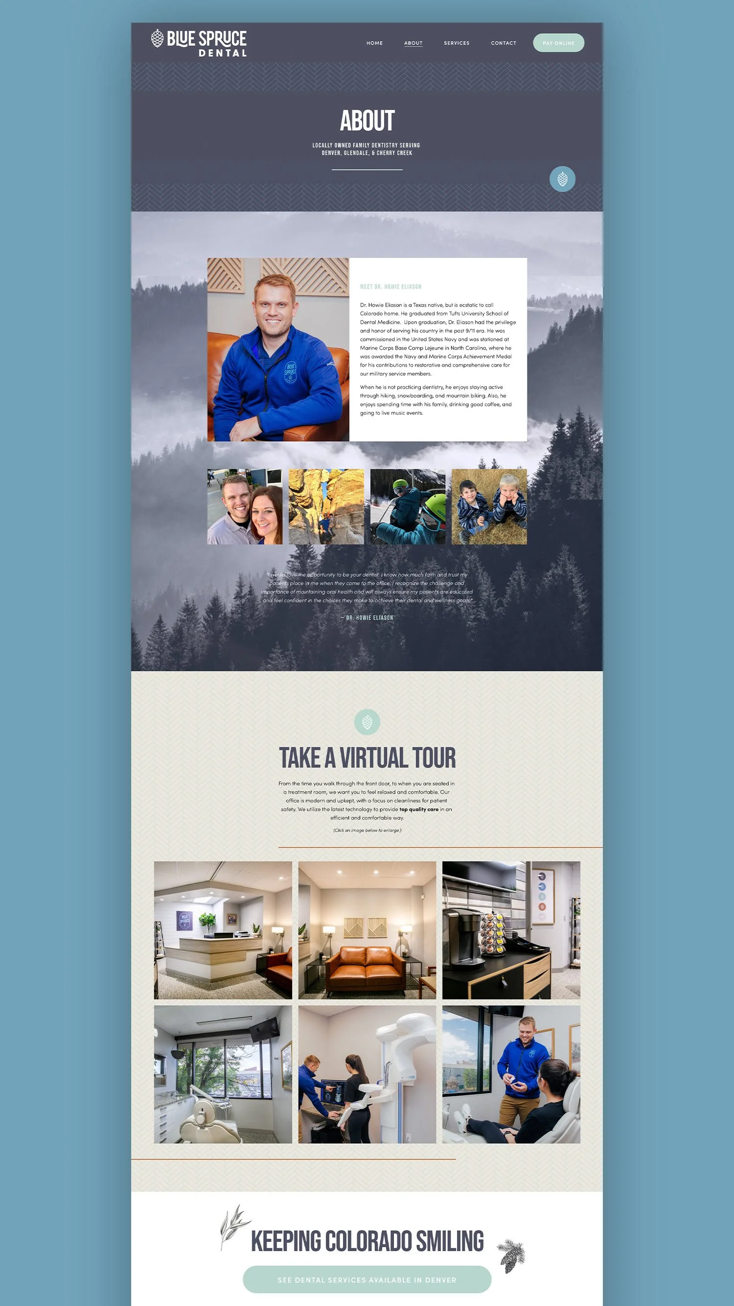
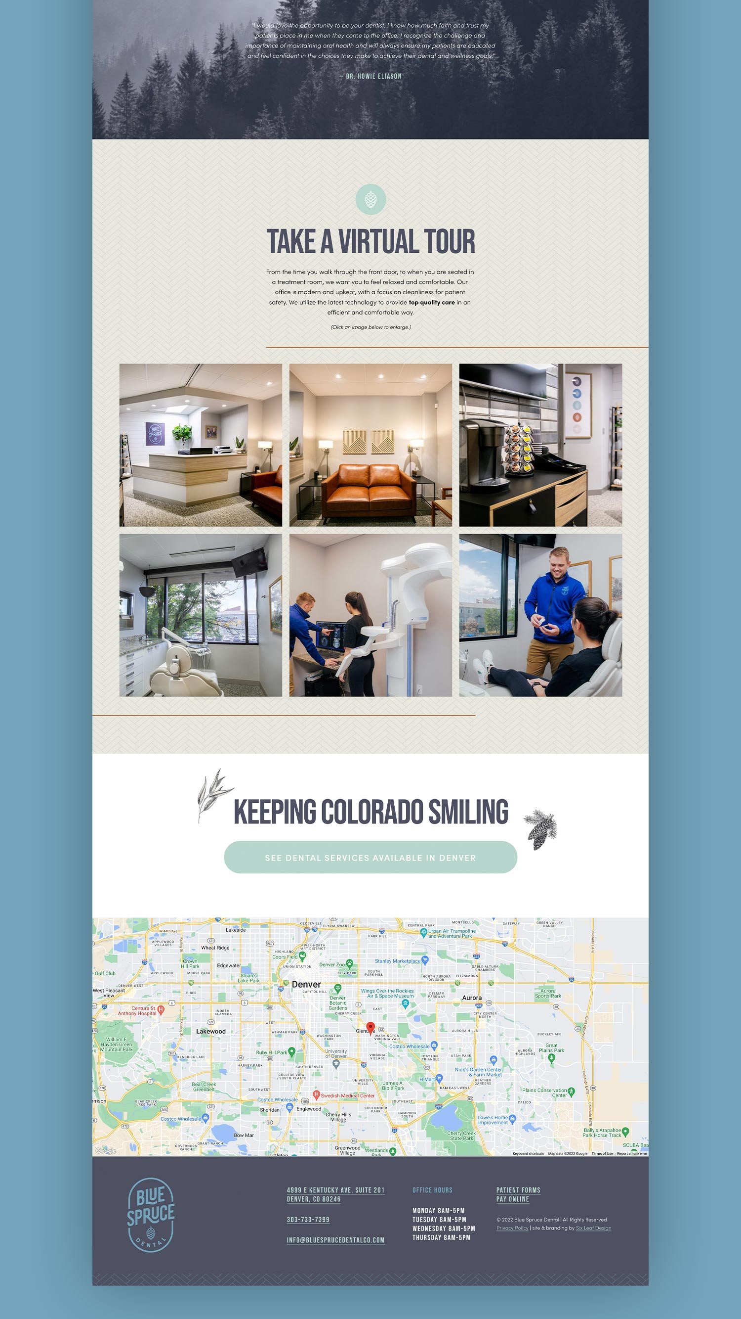
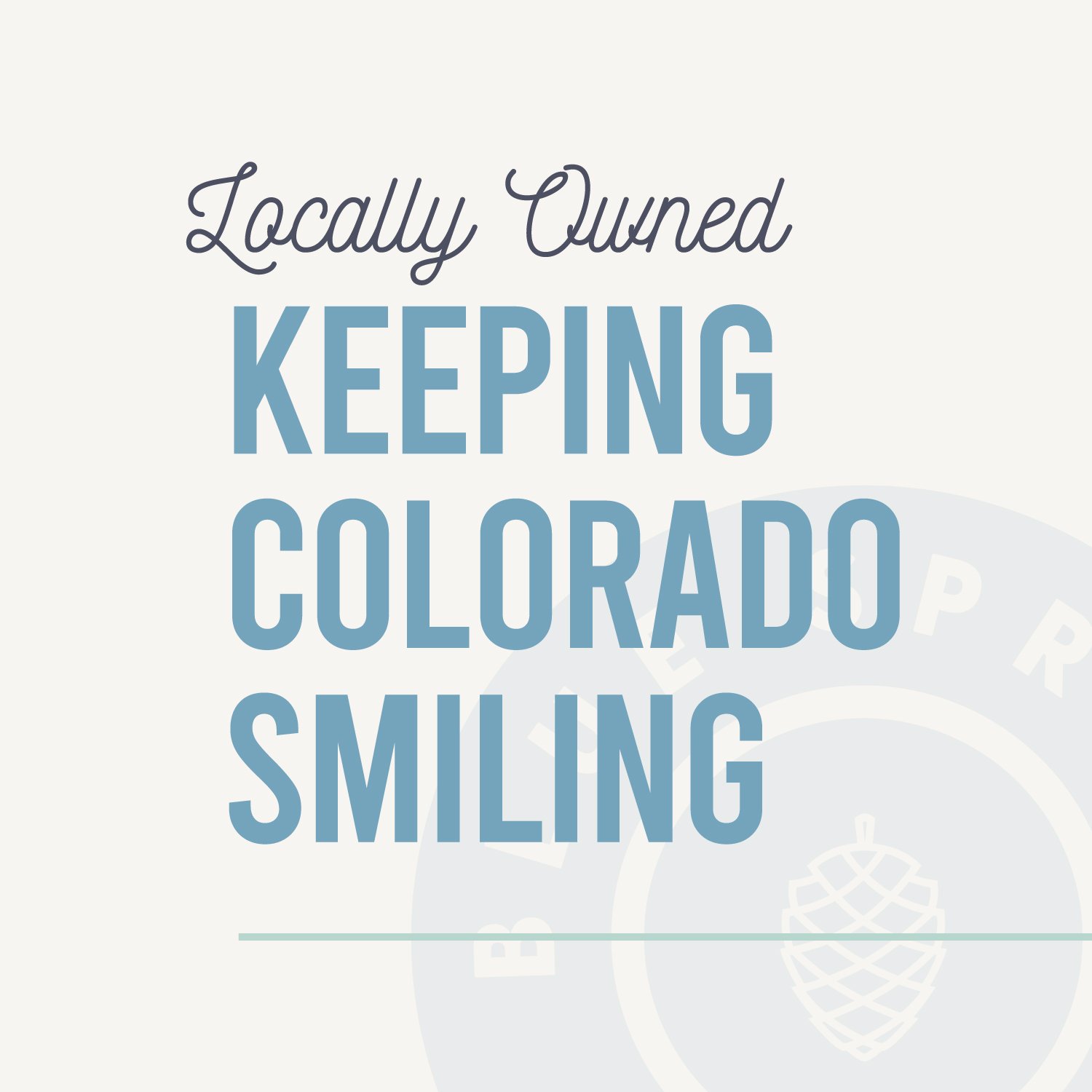
As a boutique dental practice with new ownership + a new name, Blue Spruce Dental didn’t want to feel like just another high-volume office pushing patients in and out the door. Our goal was to build a brand and website that reflected a more personal approach to dentistry rooted in trust, long term relationships, and genuinely easing dental anxiety. The challenge: create a cohesive, modern identity that felt clean, calming, and distinctly Colorado without falling into cliché dental visuals — then bring that ease and trustworthy experience through to the website.
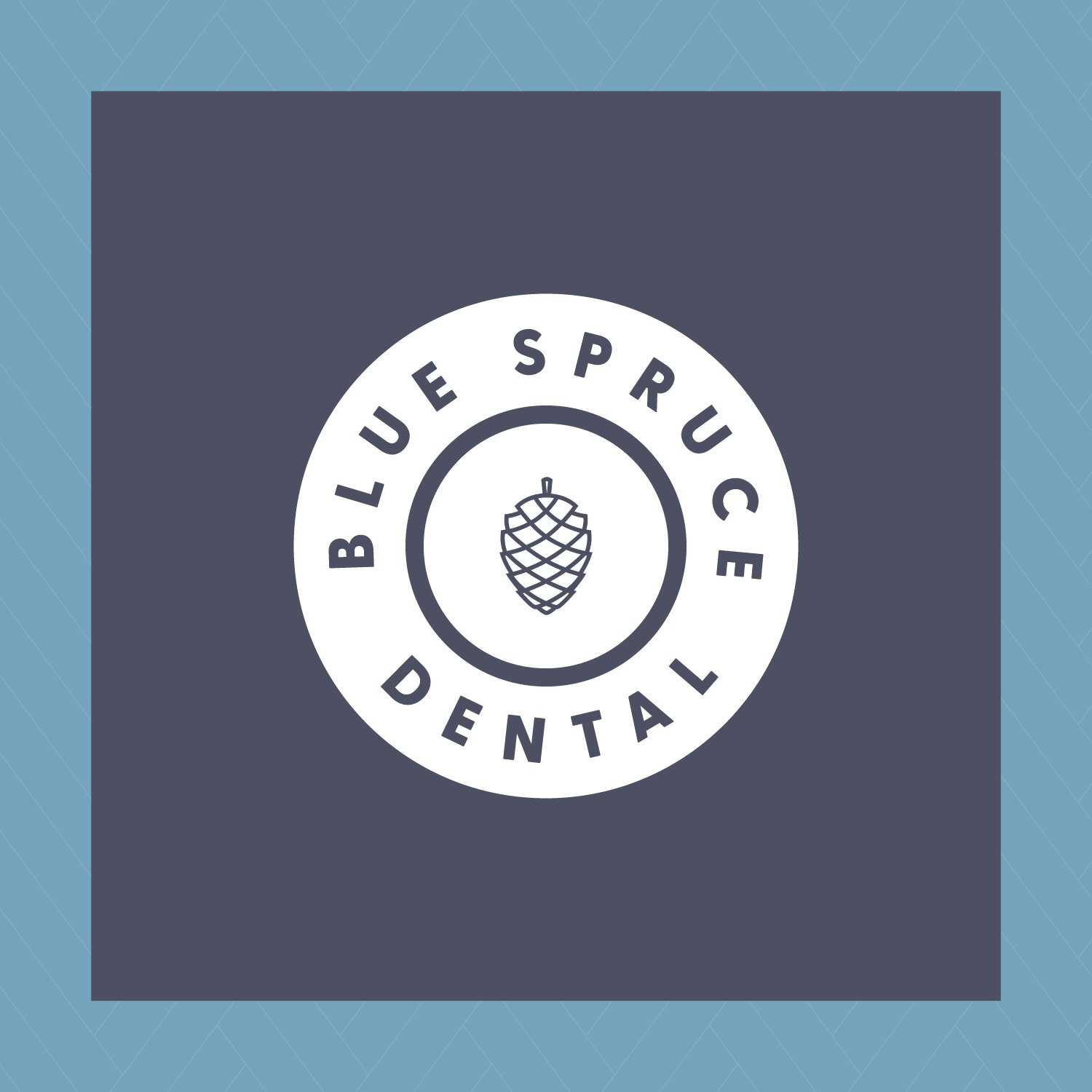
BEHIND THE LOGO
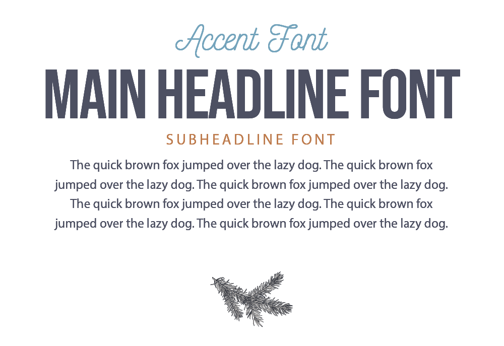
The Blue Spruce Dental logo was designed to be wholesome and clean, with a nod to vintage brewery brands from Colorado. The main font was selected for the condensed blocky style and curves, and the secondary font was selected because of its round, friendly nature.
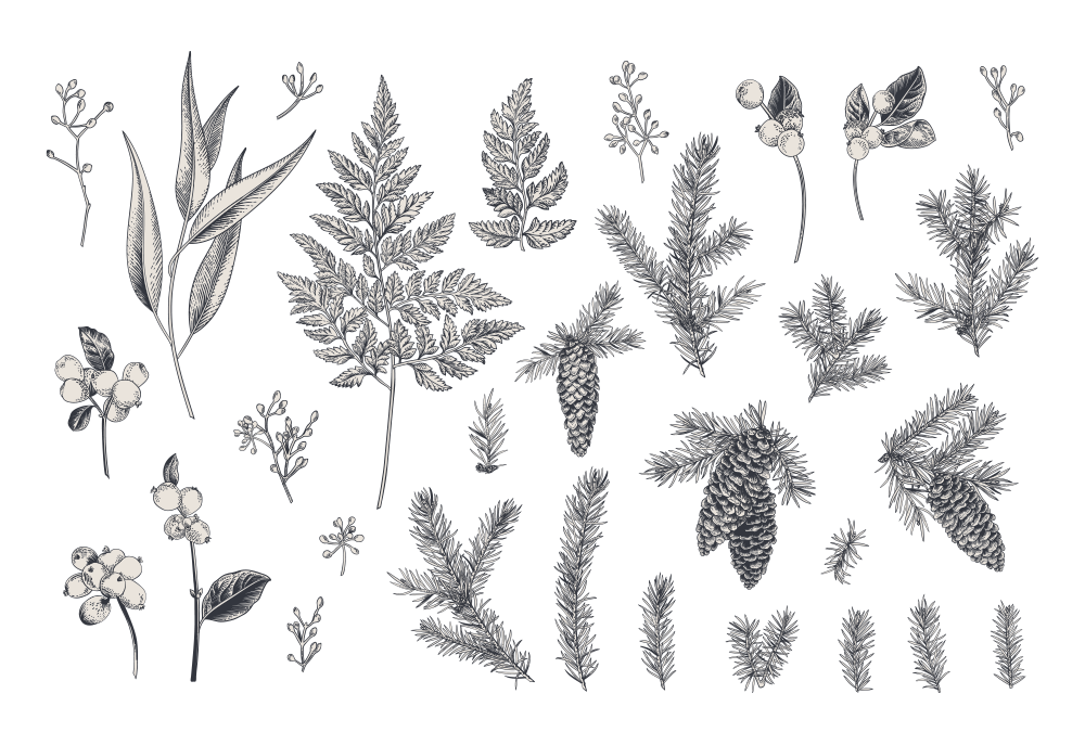
With our focus on locality and attention to detail, everything from the pinecone icon to the customizations of the lettering is a reflection of the personal service we provide.
WHAT WE DID:
Creative Direction
Custom Logo System
Tagline Development
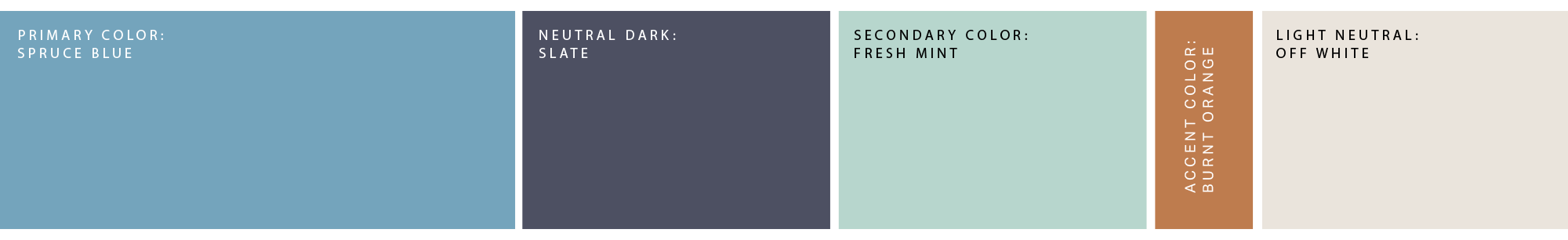
Color Palette & Usage
Typography & Hierarchy
Brand Guidelines
Brand Accents
Signature Patterns
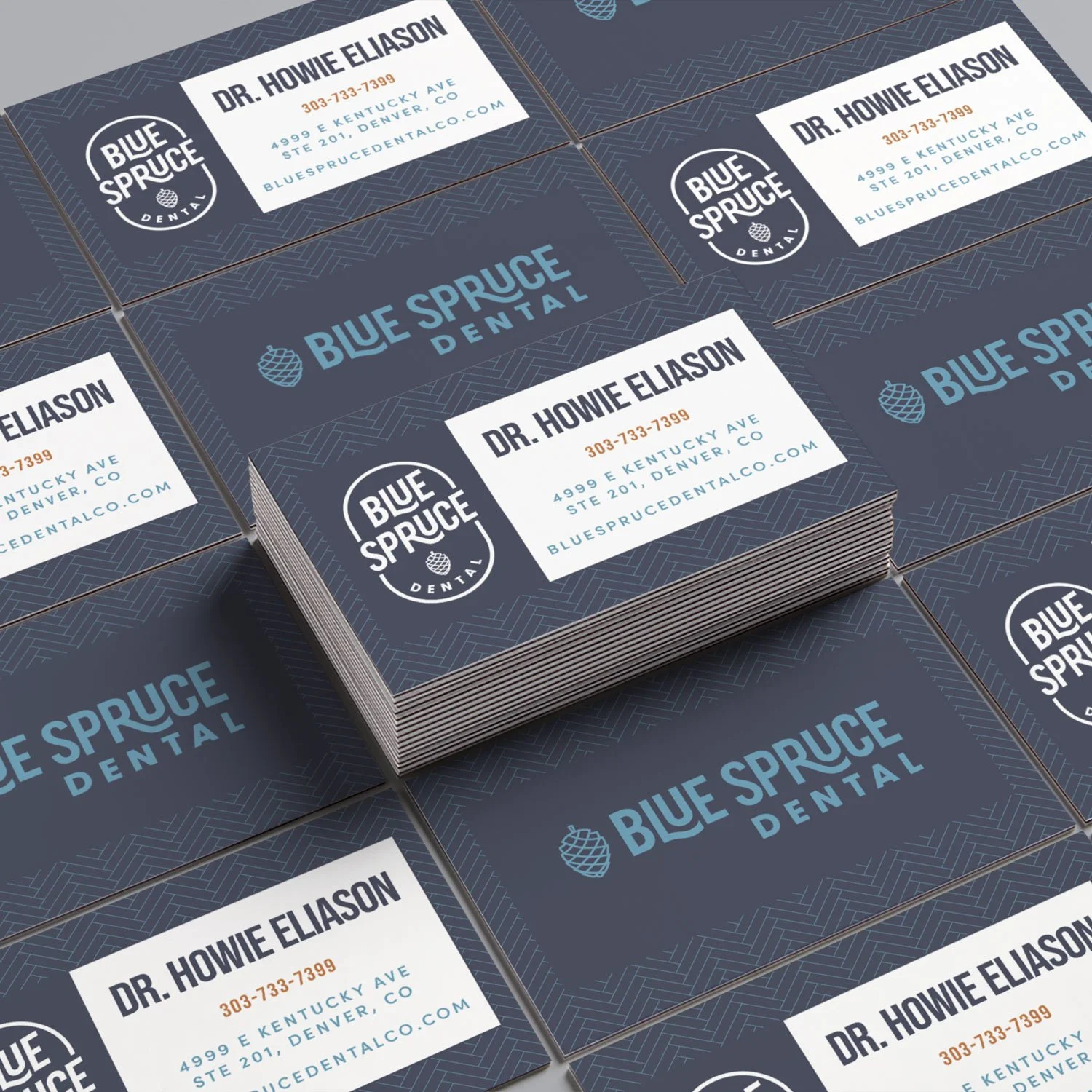
Business Cards
Stationery
Signage
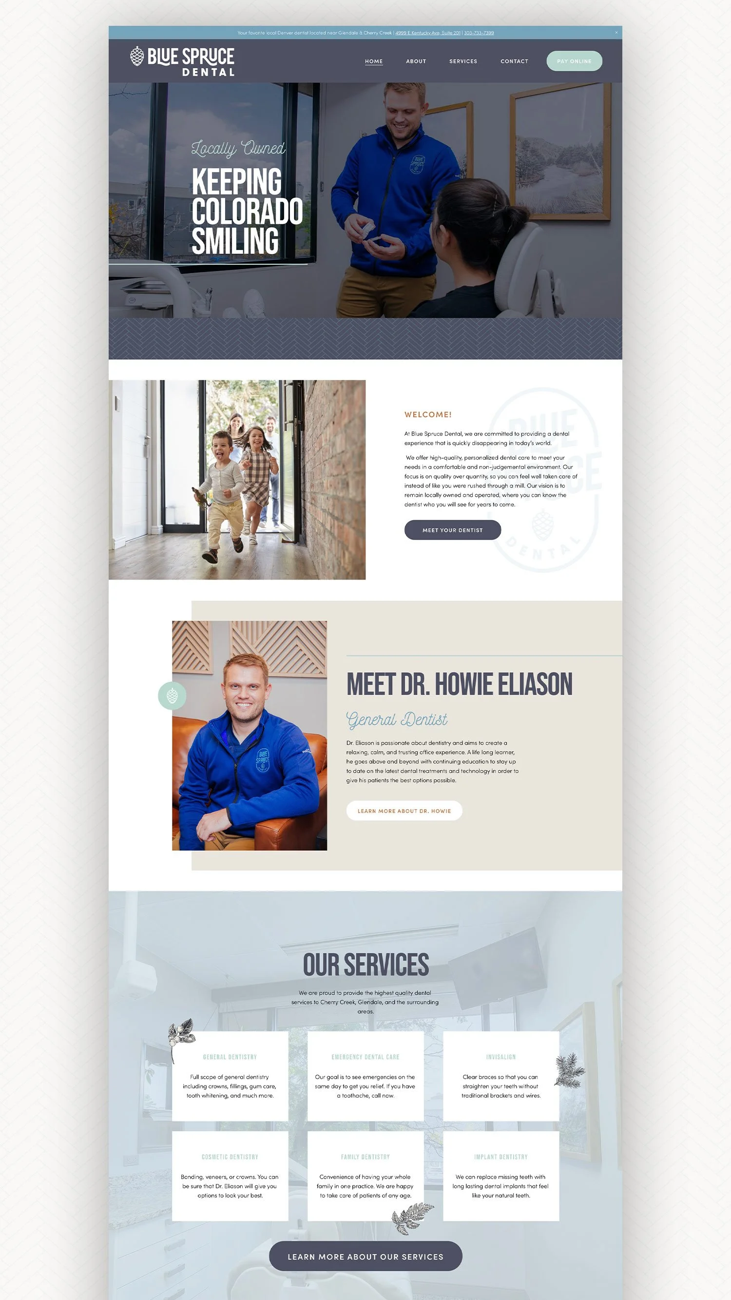
Website Strategy
Website Design & Development

“Everything turned out great and it was money well spent.”
Lindsey is an amazing designer with fresh ideas. My logo and subsequent website design exceeded my expectations and the process couldn’t have been smoother. Highly recommend! Many many positive comments from current patients, which has validated the decision to rebrand. And new patients are saying our sign with the logo caught their attention.
dr. Howie Eliason // DDS & OWNER, Blue Spruce Dental